Why generic stock backdrops fail modern ecommerce stores
Inserting a raw product image into a generic stock backdrop often results in a visual disconnect that instantly breaks shopper immersion. Inserting a raw product image into a generic stock backdrop often results in a visual disconnect that instantly breaks shopper immersion. When light directions do not match, or when shadows do not fall realistically beneath the product base, the human brain identifies the image as a poor copy-paste assembly. This visual mismatch triggers caution in potential buyers, who associate disjointed imagery with low-budget dropshipping operations or unreliable sellers. Brands struggle when trying to utilize static stock photos for unifying supplier catalog imagery, because every original supplier photo has unique studio light levels, while every stock photo has its own independent sun angle or overhead color temperature.
Furthermore, standard stock image platforms offer limited settings that rarely align with specific branding palettes. A brand selling premium skincare may want its bottles placed on a textured travertine block with soft morning light from a 45-degree angle. Finding a stock photo matching this layout, while also aligning with the bottle's high-angle camera perspective, is incredibly rare. Relying on basic background removal programs that simply paste flat products onto unrelated sceneries leaves catalogs looking chaotic, ultimately driving up customer acquisition costs as paid traffic bounces from disjointed product detail pages.
How do AI background generators construct realistic shadows and light?
Modern background generators utilize diffusion-based AI networks to read the boundary data of your product and calculate realistic environmental interactions. Modern background generators utilize diffusion-based AI networks to read the boundary data of your product and calculate realistic environmental interactions. Instead of treating the product as a flat sticker, the AI analyzes the geometric shape, color profile, and metallic or glass properties of your item. It then models how virtual light waves would bounce off its surfaces, creating highly accurate contact shadows, cast shadows, and soft ambient light reflections. This attention to physical light behavior is what makes generated lifestyle scenes indistinguishable from actual studio setups.
For example, if you place a glass bottle containing a liquid on a wooden tabletop, the generator does not merely draw a dark smudge underneath. It creates refractive highlights, allowing the texture of the wood to show distortedly through the glass edges while casting a soft shadow that conforms precisely to the bottle's base. This physical realism is crucial for lifestyle product photos without a photoshoot, allowing store owners to test dozens of ambient environments with zero physical setup costs.

Six retail scenarios where automated scene generation changes the workflow
Different ecommerce channels require distinct visual priorities to succeed. Different ecommerce channels require distinct visual priorities to succeed. A clean white background that performs well on Amazon will fall flat on Pinterest, where contextual lifestyle images drive high user engagement. Understanding how to adapt your single product photo across diverse digital environments allows you to build a cohesive multi-channel presence. Below are six common operational scenarios showing how online store managers can deploy AI-generated scenes effectively.
Shopify product page refresh: A direct-to-consumer pet brand wants to change their dull white-background images to warm, home-centric scenes. They generate background templates featuring sunlit kitchen floors or soft rugs, placing their pet toys naturally within these cozy contexts to establish a welcoming atmosphere.
Amazon listing hero gallery upgrade: Marketplace sellers must follow strict main-image rules but can use lifestyle context for the remaining gallery slots. By placing an espresso maker in a modern kitchen background, they show scale and kitchen utility without rent-out costs, directly elevating your Amazon listing graphics.
Pinterest aesthetic theme testing: An outdoor gear brand tests visual styles by placing a water bottle in three distinct backdrops: a mossy mountain trail, a sandy beach, and a gym locker room. This allows them to identify which demographic group engages most with their promoted pins.
TikTok ad creative asset generation: Marketers need high-impact visuals to stop user scrolling. Placing a colorful cosmetic tube against striking, vibrant monochromatic clay stages creates high-contrast images that quickly grab attention in short-form video feeds.
Multi-region local asset localization: An online coffee brand scaling into Europe replaces cozy American-style kitchens with minimalist European apartment interiors. This localization helps local audiences connect with the brand image immediately.
Dropshipping supplier photo overhaul: Dropshippers can replace low-quality, watermarked factory pictures with sleek, premium backdrops, creating an original brand identity out of generic catalog items.
| Ecommerce Channel | Visual Strategy | Primary Composition Focus | Lighting Setup | What to Avoid |
|---|---|---|---|---|
| Shopify Product Page | Cohesive, on-brand lifestyle shots | Product centered on textured surfaces | Soft, natural morning light | Busy, distracting backdrops |
| Amazon Gallery Images | Utility and environmental context | Product next to relatable objects | Bright, clear overhead lighting | Over-stylized, dark artistic shadows |
| Pinterest Organic Pins | Aesthetic lifestyle storytelling | Vertical compositions, warm tones | Golden hour sun or ambient outdoor glow | Plain studio gray backgrounds |
| TikTok Video Overlays | High-contrast, colorful backdrops | Bold colors, modern minimalist styling | Direct, crisp studio lights | Low-contrast neutral tones |
| Global Market Localization | Culturally aligned home settings | Regional architecture and details | Natural regional lighting patterns | Generic, unidentifiable environments |
| Instagram Carousel Ads | Aspirational styled setups | Creative prop placement around product | Dramatic side-lit shadows | Flat, textureless vector shapes |
| Email Marketing Banners | Seasonal thematic contexts | Holiday or seasonal color themes | Warm holiday glow or cool winter tones | Repetitive, non-seasonal images |
| Retargeting Display Ads | Product focus with clean accents | Isolated product on textured monolith | Vibrant backlighting to pop edges | Unfocused, busy outdoor settings |
How to keep 500 product photos visually consistent with My UGC Studio
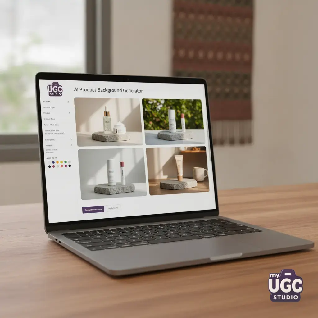
Managing high-volume asset generation without a clear process can quickly lead to visual chaos. Managing high-volume asset generation without a clear process can quickly lead to visual chaos. If a retailer uploads 500 items and generates different styles for each, their online catalog will look like an unorganized marketplace rather than a premium brand store. To address this challenge, My UGC Studio offers a structured workflow built specifically for high-volume ecommerce. The process begins by uploading your core catalog images and choosing a singular, locked visual direction. This ensures that every item in your batch is placed on the exact same surface material, under matching light angles, with identical camera focal lengths.
Instead of relying on unpredictable prompts, My UGC Studio uses exact style replication. You upload a reference product photo, lock the environmental parameters, and generate the rest of your catalog assets under those precise conditions. Once generated, a fast quality-assurance pass allows you to adjust fine placements before publishing directly to your Shopify catalog, Amazon listing, or ad platforms. This highly organized approach helps sellers update their entire inventory for seasonal promotions, keeping catalogs perfectly aligned. Readers can explore options and plan their next visual updates on the My UGC Studio pricing page or see current designs in the curated My UGC Studio gallery.
Which background styles convert best for different product categories?
Selecting the right visual backdrop requires a deep understanding of your customer's expectations. Selecting the right visual backdrop requires a deep understanding of your customer's expectations. Different product lines call for specific environmental cues to convey quality, safety, or premium craftsmanship. A sterile metal background works well for high-end electronics, but it will make organic baby food look cold and unappealing. Matching your category to the correct environmental style directly impacts how shoppers perceive your brand value.
To build an effective visual styling guide for your catalog, follow these progressive development steps:
- Identify the core emotional benefit of your product, such as relaxation for skincare or reliability for outdoor gear.
- Select three organic textures that naturally complement the product material, such as natural linen, brushed concrete, or dark slate.
- Establish a strict white-balance level to ensure all images match the rest of your Shopify product page images.
- Define clear scale limits for accent props so they never crowd or distract from the main item.
- Render variations with clean vertical and horizontal rules of composition to fit various crop formats.
By defining these parameters, you ensure that every generated scene reinforces the practical use cases of your catalog. For example, modern coffee gear looks exceptional when placed on dark soapstone countertops next to hints of warm rising steam, while pet accessories perform best on clean, sunlit hardwood floors that suggest a welcoming, pet-safe household.
How do you prevent perspective mismatch when inserting flat shots into 3D environments?
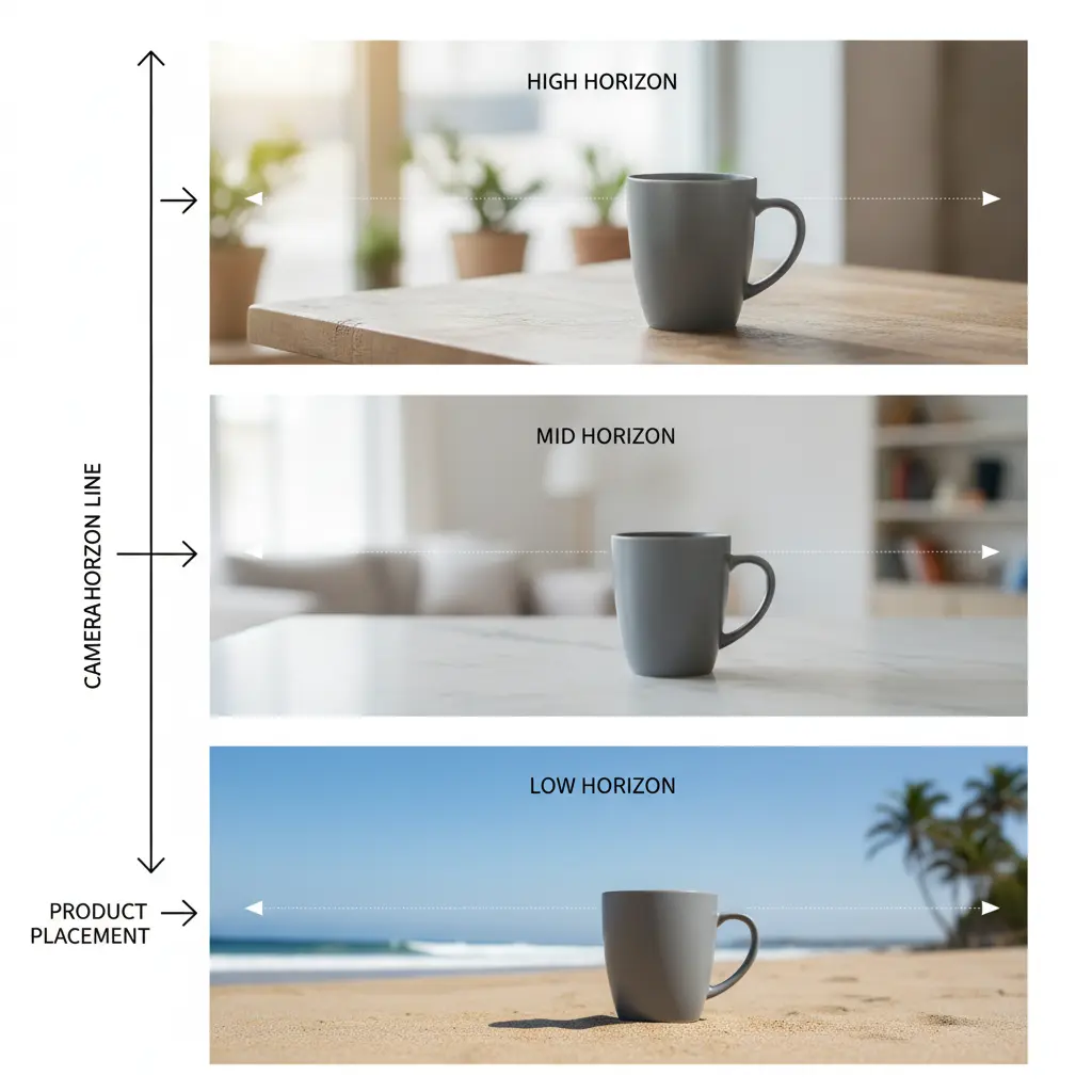
The most common error in AI-generated product images is perspective mismatch. The most common error in AI-generated product images is perspective mismatch. If your original product photo was shot from a straight-on, eye-level angle, and you place it onto a kitchen counter shot from a high, downward-looking angle, the result will immediately look unnatural. The product will appear to be sliding forward, breaking the physical reality of the scene and alienating your customers. To prevent this, you must always match the camera focal length and lens height of your source image to the generated background.
When utilizing existing studio assets, catalog managers must categorize their images by original shooting perspective: direct front-on, slight high-angle (30 degrees), or top-down flat lay. When generating backgrounds, apply those exact camera rules to the AI prompts or template styles. Ensuring that both the product and its environment share the same imaginary horizon line guarantees a seamless blend, transforming a flat cutout into a highly believable, professional lifestyle photograph. This simple step is vital when updating older eBay listings, where source assets are often limited to basic angle variations.
Transitioning from static product scenes to high-converting short-form video assets
Once you have built high-quality lifestyle scenes, your static assets can serve as the direct foundation for your video marketing pipeline. Once you have built high-quality lifestyle scenes, your static assets can serve as the direct foundation for your video marketing pipeline. High-quality background generators do not just export flat JPGs; they establish the exact spatial data needed to feed generative video tools. Using these highly realistic lifestyle layouts, you can easily turn these static layouts into short-form videos for platforms like TikTok, Reels, and YouTube Shorts. The transitions feel completely natural because the spatial layout, color grading, and lighting models are already correctly aligned.
This unified visual process dramatically reduces the cost of creative development. Instead of planning and paying for a separate video production crew, your marketing team can use the same base product models and environmental assets to generate dynamic video ads, scrolling lifestyle carousels, or animated social graphics. By maintaining absolute visual consistency across both static product listings and fast-moving video platforms, your store presents a clean, professional, and reliable face to consumers at every step of their buying journey.