Why Does Visual Inconsistency Destroy Ecommerce Trust and Conversions?
The human brain processes visual data in less than 50 milliseconds. The human brain processes visual data in less than 50 milliseconds. When a buyer lands on your collection page, they expect an immediate sense of cohesion that mirrors a high-street boutique. If they encounter a product grid featuring an eclectic mix of lighting setups, clashing backgrounds, and random camera heights, their subconscious sounds an alarm. Mismatched product cards suggest a catalog of dropshipped, low-quality goods rather than a curated selection. This lack of unity breaks the illusion of a legitimate, customer-centric brand. Visitors naturally worry that a merchant who cannot present their stock professionally will also fail on shipping times, quality control, and returns. By prioritizing a clean, unified presentation, you reduce checkout hesitation and lower bounce rates. Implementing a reliable visual strategy is no longer optional; it is a fundamental requirement to elevate your brand. Learn more about systematically managing your dropshipping brand visuals in our comprehensive guide to UGC Content Dropshipping in 2026.
How Do Supplier Assets Cause Unseen Catalog Chaos?
For online retailers using the direct shipping model, relying solely on raw, unedited supplier assets is a fast track to aesthetic decay. For online retailers using the direct shipping model, relying solely on raw, unedited supplier assets is a fast track to aesthetic decay. Each factory hires different photographers, uses different cameras, and applies custom post-processing filters. One item is presented on a stark white canvas, the next appears in a blurry home snapshot, and a third is shot outdoors under harsh, yellow sunlight. When these disparate files are loaded side-by-side into a Shopify collection, they clash violently. Instead of looking like a curated brand, your storefront resembles a chaotic flea market. This visual mismatch directly raises your customer acquisition costs because paid ad traffic will not convert on an unkempt landing page. Correcting this inconsistency is the single most effective way to improve return on ad spend. Discover how sophisticated store owners resolve this visual bottleneck in our guide to reducing CAC using UGC and consistent style assets in dropshipping.
What Visual Red Flags Trigger Scam Warnings in a Buyer's Mind?
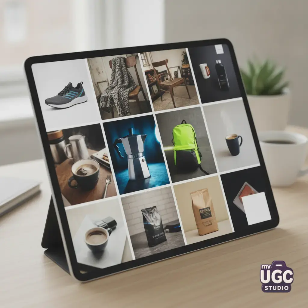
Modern shoppers are hyper-aware of digital security. Modern shoppers are hyper-aware of digital security. They guard their credit card details fiercely and look for subtle visual cues to verify a store's legitimacy. Random visual styles serve as immediate warnings of a potential scam. When a shopper sees different shadow depths, shifting horizon lines, and jagged background cutouts, they suspect the site is a temporary, fly-by-night operation. A professional store always invests in unified visual merchandising. If your product grids fail this test, buyers automatically assume your products are cheap knockoffs that will take weeks to arrive, if they arrive at all. Clean, consistent imagery acts as a silent guarantee of quality and reliable fulfillment. Removing these minor visual friction points establishes immediate store authority, comforting skeptical buyers and encouraging them to complete their purchase. A polished presentation proves that you are committed to your store for the long haul, reducing cart abandonment and driving repeat purchases. Consistent visuals transform a suspicious storefront into a trusted shopping destination.
The Catalog Chaos Matrix: Auditing Your Product Visual Mismatches
To conquer catalog chaos, you must first recognize the technical discrepancies that drive customers away. To conquer catalog chaos, you must first recognize the technical discrepancies that drive customers away. These range from lighting temperatures to framing issues. The table below lists the most common errors dropshipping merchants make and how to fix them to build a trustworthy catalog.
| Visual Mismatch | Primary Cause | Customer Perception | Corrective Action |
|---|---|---|---|
| Harsh vs. Soft Lighting | Mixed supplier sources | Unprofessional, disjointed shop | Apply uniform soft diffused side-light |
| Mismatched Camera Angles | Random camera elevations | Distorted product dimensions | Set a strict 45-degree angle |
| Background Shift | Outdoor vs. studio backdrops | Scattered inventory origin | Lock in a warm neutral stone or beige backdrop |
| Erratic Drop Shadows | Floating products on white canvas | Poor quality 2D clip art | Generate soft contact shadows on ground plane |
| Inconsistent Scale | Manual cropping variations | Mismatched actual product sizes | Ensure product occupies exactly 80 percent of canvas |
| Color Temperature Drift | Cool blue vs. warm yellow filters | Inaccurate product representation | Apply a standardized white balance profile |
| Resolution Contrast | High-res next to pixelated snaps | Outdated or scam inventory | Upscale original raw assets to 2K resolution |
| Conflicting Decorative Props | Random decorative objects | Disorganized branding | Limit secondary props to unified botanical assets |
Understanding these specific technical failures allows you to audit your catalog with a critical eye. Rather than accepting poor-quality supplier assets as an inevitable cost of dropshipping, you can systematically target and resolve each mismatch. Correcting these errors makes your product display look organized, intentional, and incredibly professional.
Establishing Your Visual Anchor: Standardizing Your Store Aesthetics
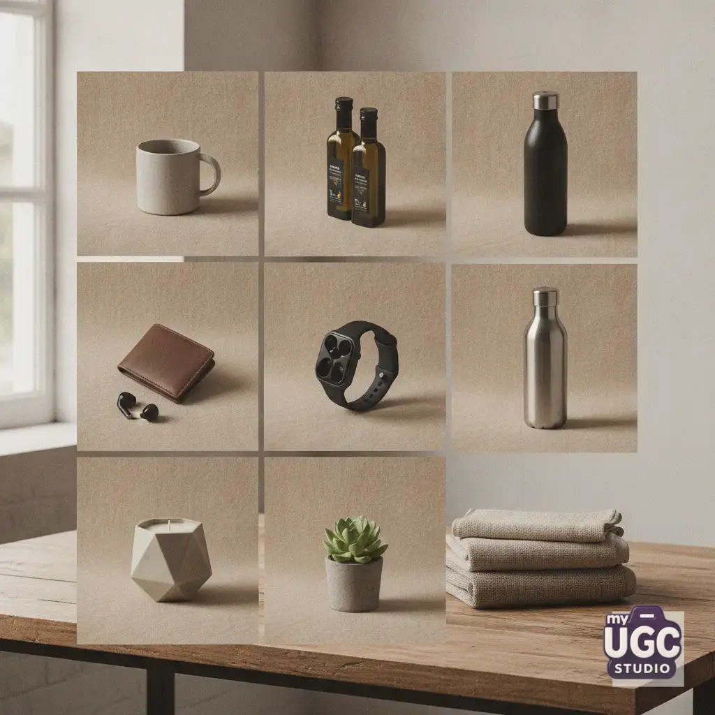
Before you begin editing your files, you must establish clear guidelines for your product display. Before you begin editing your files, you must establish clear guidelines for your product display. These rules dictate the primary light source angle, shadow softness, and background colors. For example, high-end cosmetic brands use soft diffused side-lighting and pastel backgrounds, while rugged tool stores rely on hard, high-contrast shadows and dark slate backdrops. Once you choose an aesthetic style, you must apply it to every listing. This consistency guarantees that any new collections you introduce will seamlessly blend with your existing store design. Planning your visual catalog ahead of time ensures you do not waste precious creative resources. Explore how to map out a structured visual roadmap in our detailed 30-day dropshipping content plan.
How to Keep Hundreds of Product Photos Visually Consistent with My UGC Studio
Instead of spending hours manually editing files in Photoshop, you can automate this entire process using My UGC Studio. Instead of spending hours manually editing files in Photoshop, you can automate this entire process using My UGC Studio. The platform is designed to take mismatched raw supplier images and transform them into a cohesive, beautifully aligned catalog. The workflow is simple: you upload your diverse product images, lock in a specific aesthetic direction from our curated options, and let the system standardize your assets. My UGC Studio ensures that lighting direction, drop shadows, and background textures match perfectly across fifty or five hundred listings. This consistent style generation workflow preserves the physical details and color accuracy of your products while placing them in a unified environment. Once the batch is ready, you can review the outputs and publish them directly to Shopify. Discover how other successful brands scale their visual assets by visiting our creative gallery or explore our budget-friendly options on our pricing page.
- Upload raw images: Upload the raw supplier images or simple phone snaps into the platform.
- Select style: Pick or define your desired aesthetic template from the My UGC Studio collection.
- Generate series: Execute the consistent style generation workflow to harmonize lighting, angles, and shadows.
- Perform quality check: Review the outputs for color accuracy and details.
- Publish output: Push the processed assets directly to Shopify or download them for listing.
Six Channel-Specific Scenarios: Adapting Your Aesthetic Without Breaking Continuity
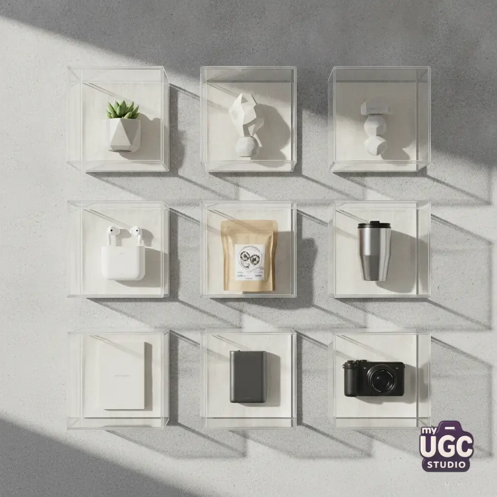
Maintaining a unified aesthetic is vital across all of your customer touchpoints. Maintaining a unified aesthetic is vital across all of your customer touchpoints. If your ad campaigns feature one style but your product page looks completely different, the disjointed transition will kill your sales. Below are six practical scenarios showing how to adapt your locked style for maximum conversions.
Scenario 1: Shopify Product Page Refresh
Situation: Expanding a skincare catalog with twenty new supplier items.
Recommended approach: Use soft, natural window lighting on a warm off-white plaster backdrop.
Alternative option: A pale pink sand texture.
What to avoid: Mixing flat, digital pure-white cutouts with organic lifestyle backgrounds.
Explanation: Consistent backgrounds make navigating between collection pages feel like a natural extension of your brand.
Scenario 2: Amazon Listing Image Overhaul
Situation: Updating high-traffic electronics listings to compete with copycat sellers.
Recommended approach: Clear, crisp studio white backgrounds with 45-degree diffused drop shadows.
Alternative option: Lifestyle infographics rendered in matching neutral wood tones.
What to avoid: Low-resolution phone snaps next to bright 3D renders.
Explanation: Clean, standardized main images improve click-through rates from search results. Read about creative expansion in our guide to scaling Shopify product creatives with AI UGC.
Scenario 3: Revamping eBay Listings Without a Shoot
Situation: Repositioning imported leather goods as premium, high-ticket items.
Recommended approach: Displaying products flat on a unified dark slate or concrete tile background.
Alternative option: Minimalist light oak wooden boards.
What to avoid: Photos shot on cluttered carpets or bedsheets.
Explanation: Professional, studio-quality flat-lays allow you to charge higher prices and attract premium buyers.
Scenario 4: Batching Creative Tests for TikTok Ads
Situation: Testing ten product variations simultaneously on short-form video feeds.
Recommended approach: Vibrant, eye-catching pastel backgrounds that instantly grab attention on mobile screens.
Alternative option: Authentic, warm home vanity settings.
What to avoid: Mixing highly polished studio ads with amateur raw phone clips in the same ad set.
Explanation: Visual continuity from the ad to your landing page prevents high bounce rates. Read more in our article comparing AI UGC versus studio productions for TikTok ads.
Scenario 5: High-Volume Catalog Generation for Pinterest
Situation: Launching a high-volume autumn apparel collection for organic Pinterest traffic.
Recommended approach: Golden hour outdoor lighting with realistic, soft branch shadows.
Alternative option: Minimal beige plaster backdrops.
What to avoid: Stark, clinical studio flashes that wash out fabric textures.
Explanation: Lifestyle-oriented aesthetics perform dramatically better in visual-first feeds.
Scenario 6: Regional Localization for European Markets
Situation: Tailoring your product visuals for German and French consumer preferences.
Recommended approach: Clean, ultra-minimalist Scandinavian room settings with cool morning light.
Alternative option: Clean matte gray backdrop tiles.
What to avoid: Retaining foreign-market decorative props or watermarks.
Explanation: Localized, high-end styling builds immediate trust with demanding European audiences. Learn more about visual localization in our ultimate guide to AI product photography for dropshipping.