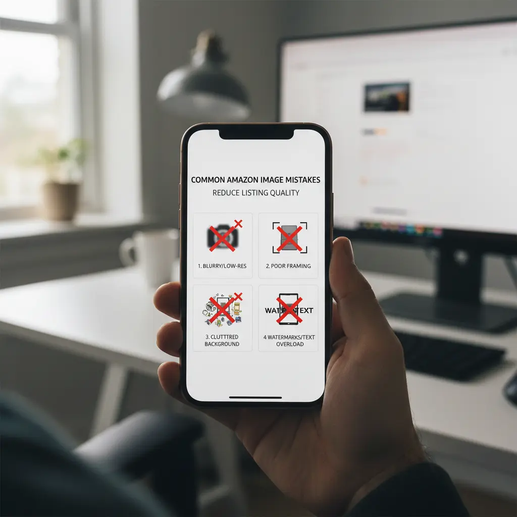
Why Amazon's Strict Image Compliance Matters
Amazon enforces precise visual guidelines because a uniform presentation fosters buyer trust, and high-quality images drive purchasing decisions. Amazon enforces precise visual guidelines because a uniform presentation fosters buyer trust, and high-quality images drive purchasing decisions. The main product image, in particular, carries stringent requirements: it must feature the product on a pure white background, occupying at least 85% of the frame, free from text overlays, logos, or watermarks. This consistent approach helps shoppers quickly identify products and ensures a clean browsing experience across the marketplace. Ignoring these rules often results in listing suppression, where Amazon conceals your product until corrections are made, directly halting sales. Prioritizing compliance for your Amazon visuals prevents disruptions and ensures your products remain discoverable.
Consider a small business launching a new line of artisanal soap bars. Their main image must clearly display the product on a pure white background. The recommended approach is to use high-resolution photography or AI-generated visuals to create a compliant main image from the outset. This ensures immediate visibility and helps avoid penalties. The alternative-using a lifestyle shot with a busy bathroom background as the main image-would likely result in listing suppression. What to avoid: any deviation from the strict white background and product-only rule for your primary listing image, as it immediately jeopardizes your product's presence on Amazon. For more on optimizing your main images, refer to our guide on Amazon Listing Images with AI: Main Image, Secondary Images, A+ Visual Workflow.

The Main Image: Your Product's Critical First Impression
Your main product image acts as the initial introduction to a potential customer, appearing prominently in search results and category pages. Your main product image acts as the initial introduction to a potential customer, appearing prominently in search results and category pages. It directly influences whether a shopper clicks through to your detailed product page. Common errors include blurry photographs, distracting backgrounds, using a colored background, or featuring accessories not explicitly part of the purchase. An incorrect aspect ratio can also distort the product, diminishing its appeal. These visual missteps frequently lead to a lower click-through rate (CTR), meaning fewer people will even view your product's description or additional images, irrespective of the product's actual quality. Shoppers form an opinion in milliseconds; you have only 0.2 seconds to capture their attention on Amazon.
Imagine an established listing for a popular ergonomic mouse that generates high impressions but suffers from a low CTR. The primary issue could be a dated, poorly lit main image. In this scenario, updating the main image with a sharp, professional, and compliant shot is essential. Sellers should A/B test different main images to determine which resonates best with their target audience. The alternative-focusing solely on keyword optimization without addressing the visual appeal-will not overcome this initial barrier. What to avoid: retaining a blurry or non-compliant main image, as it acts as a significant bottleneck, deterring buyers before they can learn more about the product. For insights into improving visuals with AI, see Amazon Listing Images with AI in 2026.
Beyond the Main Shot: Using Secondary Images Effectively
While the main image captures initial attention, secondary images serve to inform and persuade. While the main image captures initial attention, secondary images serve to inform and persuade. These visual assets provide crucial details, display the product in use, emphasize key features, and offer context that assists buyers in their purchasing decisions. Many sellers make the mistake of uploading only more static shots of the product on a white background, or worse, using low-quality, repetitive images that offer little additional value. This approach squanders a significant opportunity to answer customer questions and demonstrate practical benefits. Strategic secondary images enhance the shopper's understanding and build trust. Lifestyle images, for instance, can increase conversion by 25-40% and justify a 20%+ higher price point.
Consider a new line of natural skincare products. The main image is perfectly compliant, but the secondary images consist only of different angles of the bottle. A more effective approach involves creating secondary images that show someone applying the product, an infographic highlighting its organic ingredients, or a comparison chart illustrating its benefits over competitors. The alternative-relying on generic product-on-white shots-fails to educate and persuade with visuals, leaving potential buyers with unanswered questions. What to avoid: missing the chance to build a compelling visual narrative that addresses unspoken concerns and demonstrates real-world value. Secondary images are crucial for conveying the full value proposition.
A+ Content: Building Your Brand's Visual Narrative
Amazon's A+ Content (formerly Enhanced Brand Content) provides registered brand owners with a premium space to construct a richer brand story beyond standard images and descriptions. Amazon's A+ Content (formerly Enhanced Brand Content) provides registered brand owners with a premium space to construct a richer brand story beyond standard images and descriptions. A common mistake involves treating A+ Content as merely an extension of secondary images, leading to text-heavy modules, generic templates, or a disjointed visual experience. This overlooks its immense potential to build brand equity and differentiate products in a competitive market. High-quality lifestyle images within A+ Content are particularly impactful, creating an emotional connection and illustrating product utility, directly contributing to higher conversion rates.
For a high-end furniture brand launching a new sofa collection, simply listing dimensions in A+ modules is insufficient. The recommended strategy involves using A+ Content to tell a compelling brand story, showcasing sofas through engaging lifestyle shots in aspirational living spaces, perhaps featuring different fabric swatches or modular configurations. Detailed material close-ups or comparison charts highlighting sustainable sourcing also perform well. The alternative is to use basic A+ modules with minimal visual appeal, which fails to differentiate the brand or justify premium pricing. What to avoid: generic templates that do not leverage the full potential of this visual content to build value and brand narrative. Explore our blog for examples of powerful A+ content strategies.
Designing Amazon Images for Mobile Shoppers
The vast majority of Amazon shoppers browse and purchase using mobile devices. The vast majority of Amazon shoppers browse and purchase using mobile devices. If your images are not specifically optimized for smaller screens, you risk alienating a significant segment of your potential customer base. Common pitfalls include using tiny, unreadable text in infographics, images that fail to scale properly, or aspect ratios that crop awkwardly on phones. These issues create frustration for the user, often leading to quick exits from your product page and lost sales. A mobile-first approach is essential for a seamless shopping experience, ensuring accessibility and clarity for every shopper.
Consider a portable blender brand that includes a detailed recipe list as an image. If this image appears clear on a desktop monitor but becomes illegible when viewed on a smartphone, it creates a significant barrier to purchase. The recommended solution is to redesign infographics and text overlays to ensure legibility on small screens, using larger fonts and simpler layouts. Providing a clear, zoomable size chart as a separate image is an option, but ideally, incorporate responsive information directly into the product description. The alternative-assuming desktop users will suffice or customers will simply ask questions-leads to a poor customer experience. What to avoid: relying on small, pixelated text or complex images that frustrate mobile shoppers and directly impact conversion rates. For further reading, check Optimizing Amazon Product Visuals: Product-Only vs. Lifestyle Images for Conversion.
Leveraging AI for Flawless Amazon Product Visuals
Many common Amazon image mistakes stem from limited resources, a lack of professional design skills, or the sheer volume of assets required for a comprehensive listing. Many common Amazon image mistakes stem from limited resources, a lack of professional design skills, or the sheer volume of assets required for a comprehensive listing. AI-powered visual generation tools offer a robust solution to these challenges. They can produce high-quality product photography, generate diverse lifestyle shots in various settings, ensure consistent branding elements, and even transform static images into engaging video content, all without expensive photoshoots or dedicated design teams. This accelerates content production and helps maintain high visual standards across your entire product catalog.
For instance, a dropshipping business often starts with generic, low-quality supplier images that lack brand identity. The recommended approach is to leverage AI to transform these unbranded visuals into high-quality, professional-looking images with custom backgrounds and compelling lifestyle contexts. This enables the rapid creation of a professional and branded product catalog, significantly boosting perceived value and conversion rates. The alternative is to either hire expensive photographers for each product-which is not feasible for dropshipping-or rely on basic supplier images, which makes products appear untrustworthy. What to avoid: launching with poor-quality visuals that erode customer confidence. AI tools like My UGC Studio can generate stunning, compliant visuals at scale, effectively bypassing many common pitfalls and enhancing brand perception. Discover how to improve Amazon listing visuals without a studio by visiting Elevating Amazon Listing Visuals with AI, No Studio Required. Also explore how to transform Generic Dropshipping Images into Branded Visuals with AI.

Developing a Proactive Amazon Visual Strategy
Optimizing your Amazon image strategy involves a continuous cycle of creation, review, and adaptation. Optimizing your Amazon image strategy involves a continuous cycle of creation, review, and adaptation. By understanding the core mistakes and leveraging modern tools, sellers can significantly enhance their listing performance. This approach moves beyond simply uploading pictures to strategically crafting visual assets that communicate value, build trust, and convert shoppers. A proactive strategy ensures your brand maintains a competitive edge and adapts to evolving marketplace demands.
A practical content decision involves looking beyond just the main image, understanding that all visual elements-from secondary angles to A+ Content modules-contribute to the overall buyer experience. For instance, brands can use AI to quickly generate variations of lifestyle shots for different customer segments, then A/B test these within their Amazon experiments. This iterative process refines your visual assets based on real customer engagement data, ensuring your images are always working optimally for your sales goals. To scale your visual assets efficiently, consider visiting the My UGC Studio pricing page.
Key Image Mistakes and Better Approaches
| Image Type | Common Mistake | Better Approach |
|---|---|---|
| Main Image | Blurry, non-white background, text overlay | Sharp, pure white background, product fills 85% frame, no text or logos |
| Secondary Image | Repetitive, low quality, lack of variety | Feature specific details, lifestyle context, infographics, unique selling points |
| A+ Content | Text-heavy, generic modules, no brand story | High-quality lifestyle imagery, brand storytelling, comparison charts, clear benefits |
| Mobile Images | Tiny unreadable text, poor aspect ratio | Legible text, optimized aspect ratios, responsive design considerations |
| Infographics | Cluttered, too much text, inconsistent branding | Clean design, concise points, consistent fonts/colors, clear benefit statements |
| Lifestyle Images | Unrealistic, poor lighting, stock photos | Authentic scenarios, diverse models, good lighting, AI-generated custom scenes |
| Image Ratio | Non-square (for main image), inconsistent | Square (1:1) for main, varied for secondary (e.g., 3:4, 4:3) where appropriate |
| Text Overlays | Excessive, non-compliant claims | Minimal, compliant, benefit-focused, large legible font |
Steps for a Visual Audit and Improvement
- Review Amazon's current image guidelines for your specific product category.
- Compare your current main image against top-performing competitors' visuals.
- Audit all secondary images for relevance, clarity, and unique selling points.
- Assess your A+ Content for effective storytelling, mobile readability, and brand consistency.
- Check all images for compliance issues, including text overlays and potentially misleading claims.
- Consider using AI tools to generate improved versions of underperforming visuals, especially lifestyle shots.
- Monitor key metrics such as Click-Through Rate (CTR) and conversion rate after implementing visual changes.